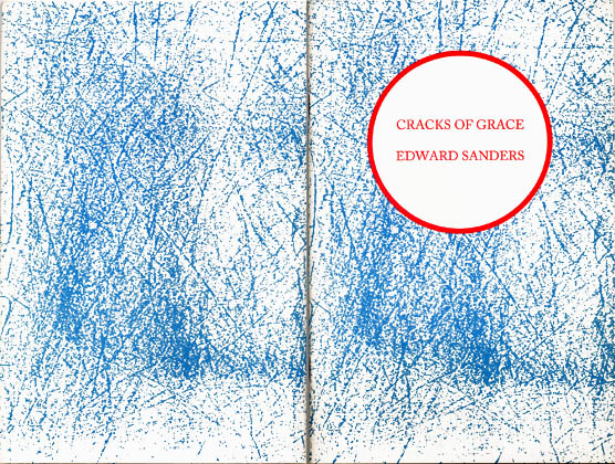
This book is made up of short poems with themes reminiscent of the verse
histories Sanders has been working on in recent years. Its sketches,
scherzi, and anecdotal meditations may act as a good introduction to
the longer works. Sander's ability to confront absurdity and/or
monstrosity with humor and economy have an elan in these miniatures
which lesser poets would find difficult to handle.
The book provided me with some interesting ideas to play with as designer.
I associated the title with dawn in Dostoievsky's exile in Siberia, an
historical situation around which others orbit in the book. For the
cover ground, I borrowed a pattern I had created to suggest underbrush
in one of my Clouds Over Fortjade workings. The blue ink I specified
should carry ambiguities as to whether it's washed out or delicate. It
should also have a sweet quality in conjunction with the orange second
color on the cover. I wanted the colors of the cover to suggest hope
and the surprise of such beauties as sunrise, whether in happy or in
utterly miserable circumstances.
Sanders provided me with a drawing of Dostoievsky in a circular mirror
with a base. I repeated circles in various places throughout the book
to unify its wandering subject matter. On the first side of the
last leaf, a photo of Sanders appears in the circle. On the other side, the
circle is empty. This could bring in Buddhist overtones as well as tying
Sanders to Dostoievsky and his group of friends who could be called
"a circle." The circle on the front may also suggest a pale sun in a cold
land, or the recurrence of themes of wealth and want, power and
persecution, ideals and sell-outs, wonder and indifference.
Although the book was meant primarily to promote a reading and a reading
series, it seemed to have a stronger significance for Sanders than i
would have expected. During several years after i did the book, he sent me
notes of appreciation, in one going so far as to say that he got a rush
out of the book every time he looked at it even after the passage of time.
This is extremely rare and hence particularly welcome for book designers.
